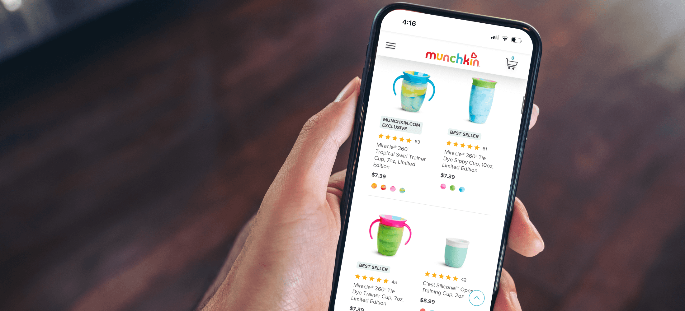
Munchkin Product Listing Page
Smarter browsing, better discovery, fewer dead ends.
Role
Senior Digital Designer, UI/UX
Industry
Retail: Infant and Toddler
Tools
Sketch, Adobe Creative Suite
Problem
Users were browsing visually and largely ignoring filters. On mobile, 50% of sessions on the Bath category page scrolled past pagination entirely, suggesting the filtering tools weren't resonating. The result: shoppers getting stuck in a single collection and missing the broader product range.
Goal
Redesign Category Pages to guide more intentional browsing, surfacing related products, reinforcing reasons to buy direct, and giving users the information they need to compare options and buy with confidence.

• Added category pills to encourage exploration beyond the current page • Introduced attribute flags: "Web Exclusive," "New," and "Best Seller" to surface key product signals • Improved mobile product cards with color swatches, star ratings, and review counts • Refined visual hierarchy across image sizing, typography, and spacing for easier scanning • Updated pagination styling to improve visibility against the white background


• Built category-specific filters so users shop by criteria that actually match what they're looking for • Added age-based filtering in 3–6 month increments from newborn to 3+ years • Introduced material filters (bamboo, BPA-free, stainless steel) for feeding and cup categories • Implemented sticky Clear and Apply buttons for consistent access throughout the filtering experience • Designed a slide-out filter panel with a semi-transparent background so users can see results update in real time as they refine

Enabled multi-select filtering with live feedback: the Apply button dynamically reflects the number of active filters, and selections appear as pill-style tags with an updated filter icon count, keeping users in control of their results.

Added lifestyle imagery to desktop hover states so users could see products in context: a change that received positive feedback. For the Miracle® 360° Tie Dye Cup launch, designed custom pattern swatches to accurately reflect each tie-dye variation.
Outcome
Click-Through Rate (CTR) on Product Cards increased by: +20%
After visual and UX changes made with image sizing and adding lifestyle image hover states, adding labels etc.)Filtering & Sorting Usage Rate increased by: +25%
After making filters more visible, mobile-friendly, and intuitively grouped and relevantTime on Page increased by: +15%
The baseline was about 45 seconds and increased to about 60 seconds.
Other projects
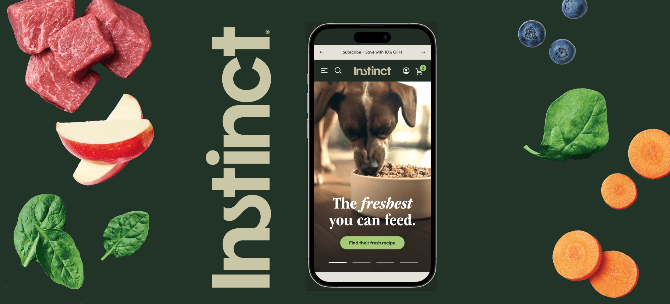
New: Instinct Pet Food Homepage
Nothing is fresher than raw

New: Instinct Product Details Page
Better product storytelling, smarter navigation, more confident buying decisions.
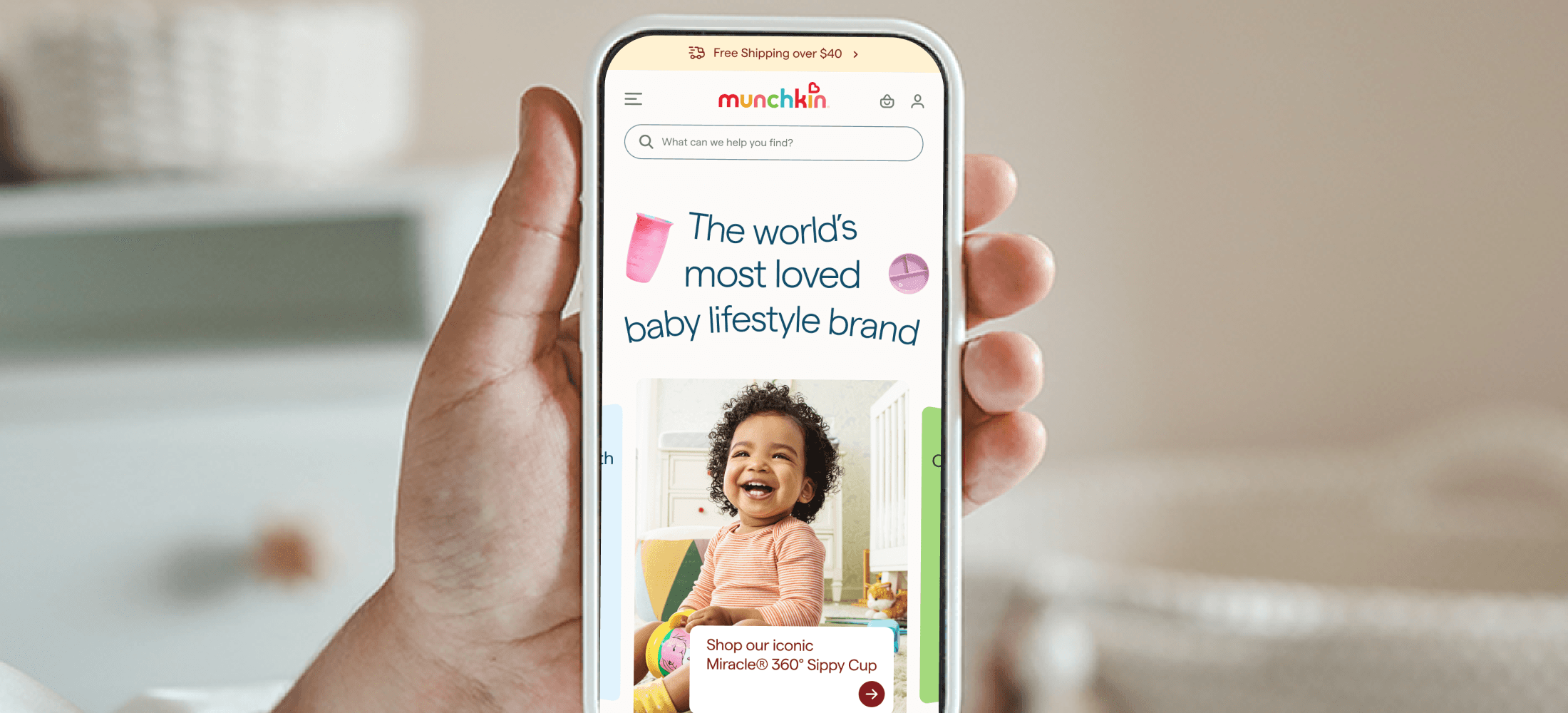
Redesign: Munchkin Homepage
A elevated shopping experience for one of the most trusted names in baby and family.
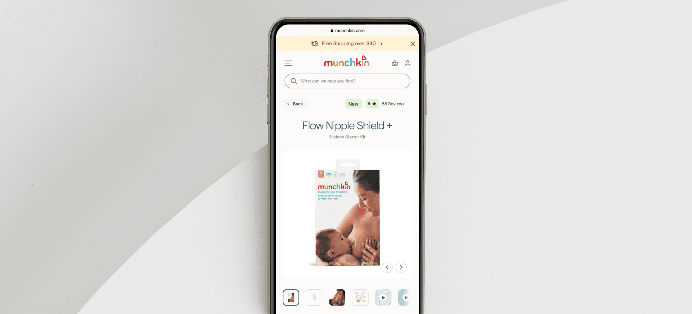
Redesign: Munchkin Product Details Page Template
A scalable PDP template built to support 158 products across six categories.
Munchkin Design System
An atomic Figma system built to scale with the brand.
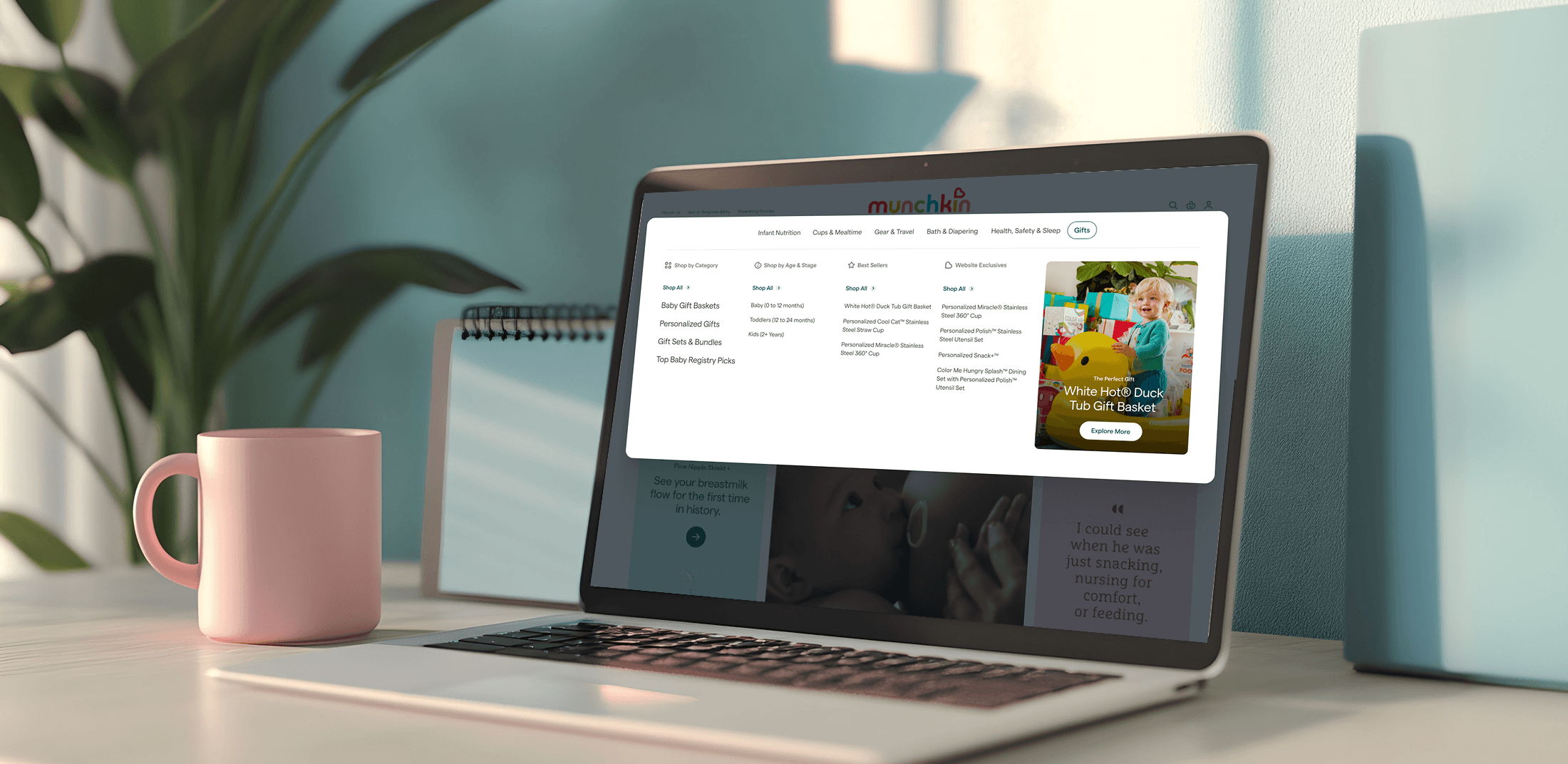
Redesign: Munchkin Menu
Restructured to match how parents actually shop: by age, stage, and need.
Build Your Own Cup
A proof of concept for personalized cup design and the research that shaped what came next.

Welcome Series Emails
A mobile-first welcome series that sets the tone for new Munchkin customers.
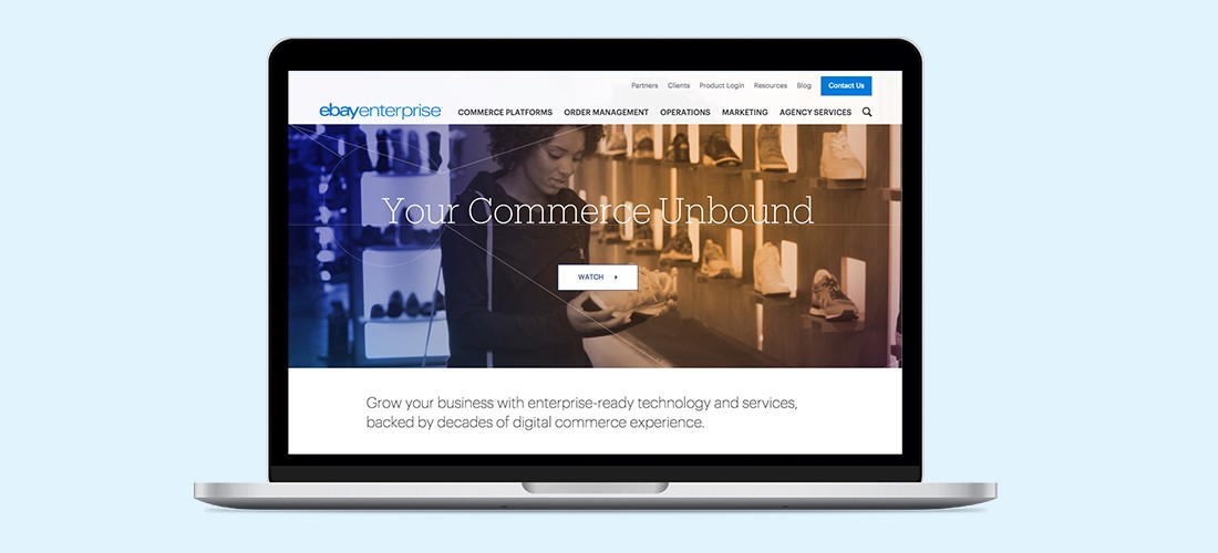
Redesign: eBay Enterpise Home
Rebuilding ebayenterprise.com from the ground up, starting with making it readable.
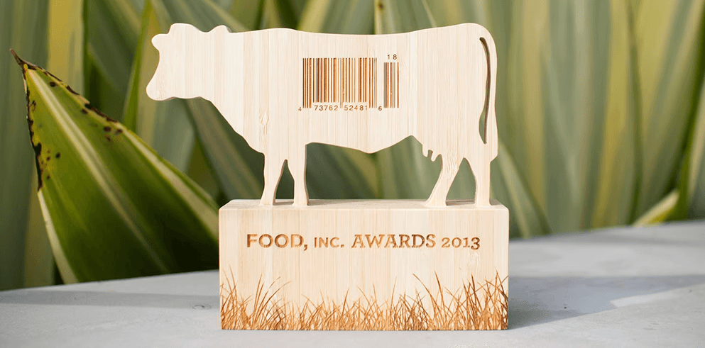
Food, Inc. Awards Trophy
Honoring individuals who embodied the documentary's message of promoting healthier food choices.
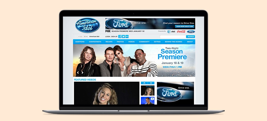
American Idol, Season 10: Homepage Redesign
Enhanced social features and live content throughout AmericanIdol.com
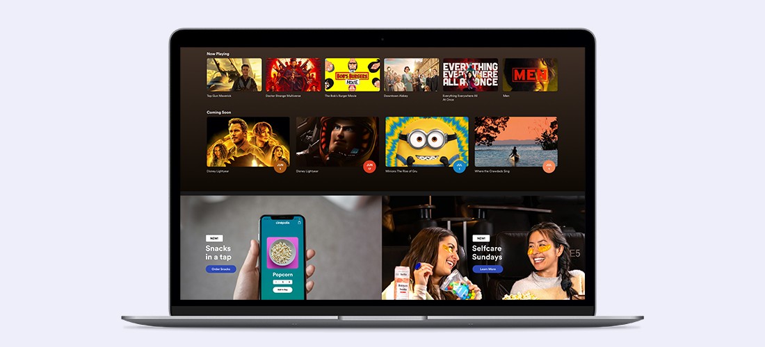
Cinépolis Movie Theater Snack Buying Feature
Snacks in a tap