Redesign: Munchkin Product Details Page Template
A scalable PDP template built to support 158 products across six categories.
Role
Senior Digital Designer, UI/UX
Industry
Retail: Infant and Toddler
Tools
Figma, Adobe Creative Suite
The Challenge
Parents trust brands they already know — and only embrace innovation when it clearly solves a real problem. With 158 products across six categories, Munchkin needed a PDP template that could scale across simple, configurable, and premium products while educating users and supporting confident purchase decisions.
The Goal
Redesign the PDP to do more than display a product: make it teach. Improve content strategy around quality, safety, and real-life use, and build a richer Benefits & Features section with stats, customer insights, and media that drives deeper engagement.
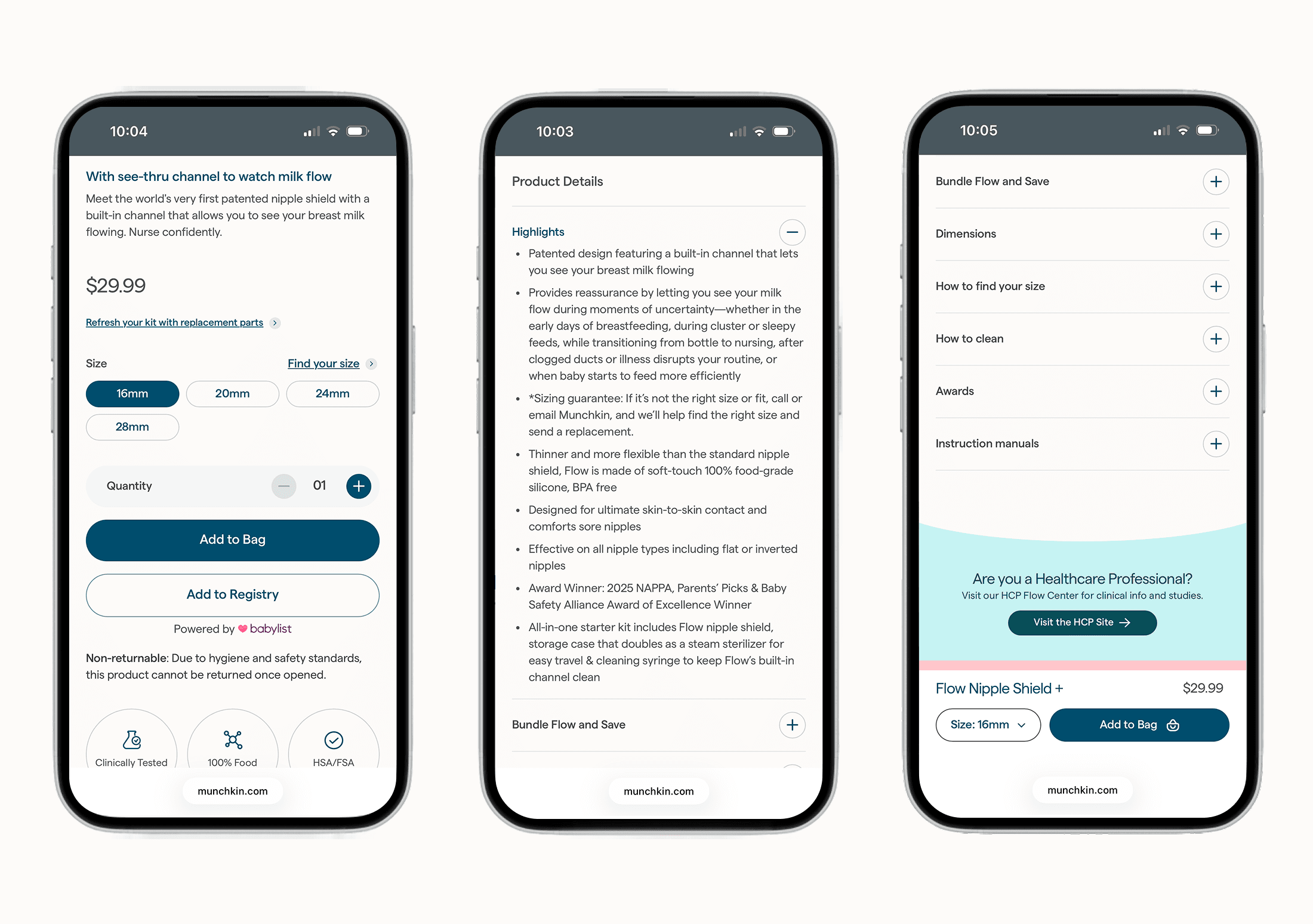
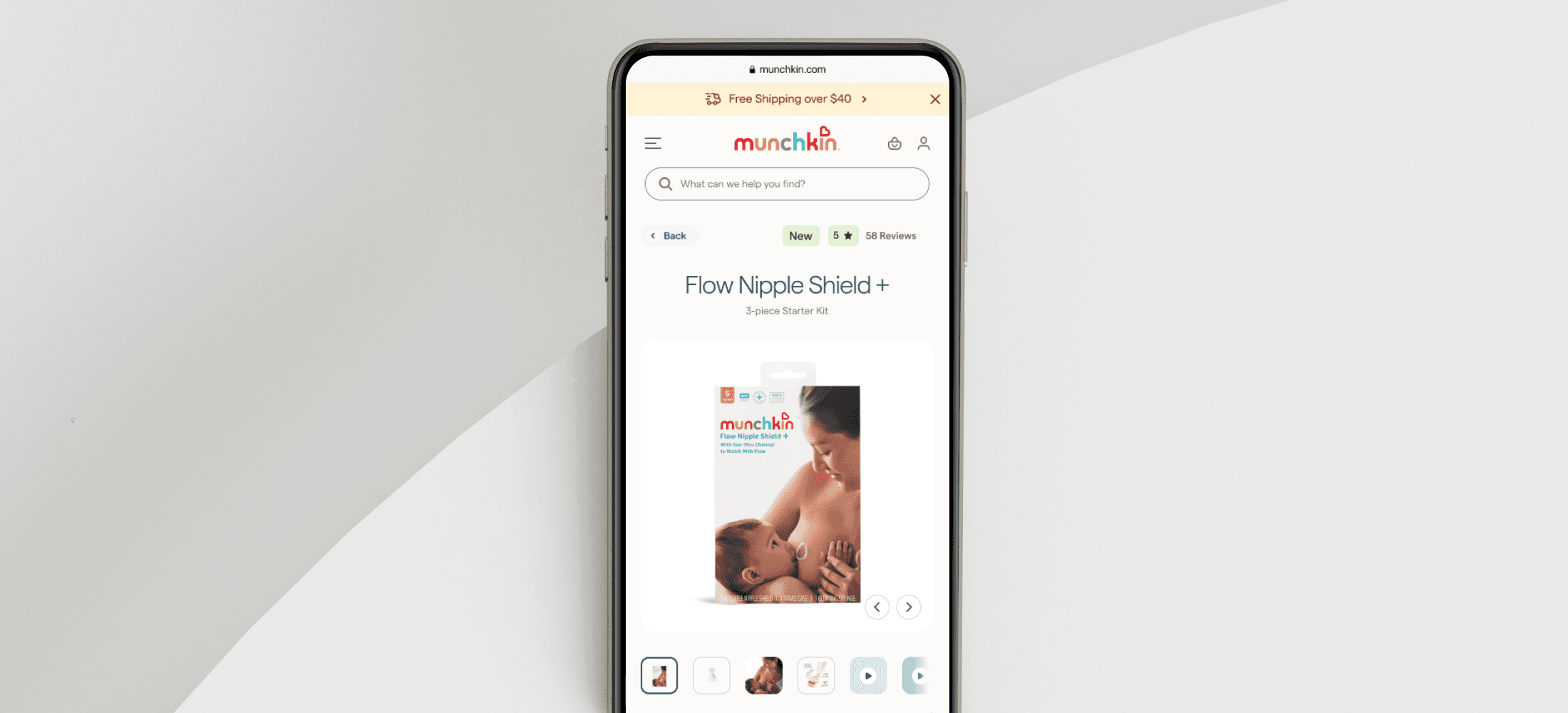
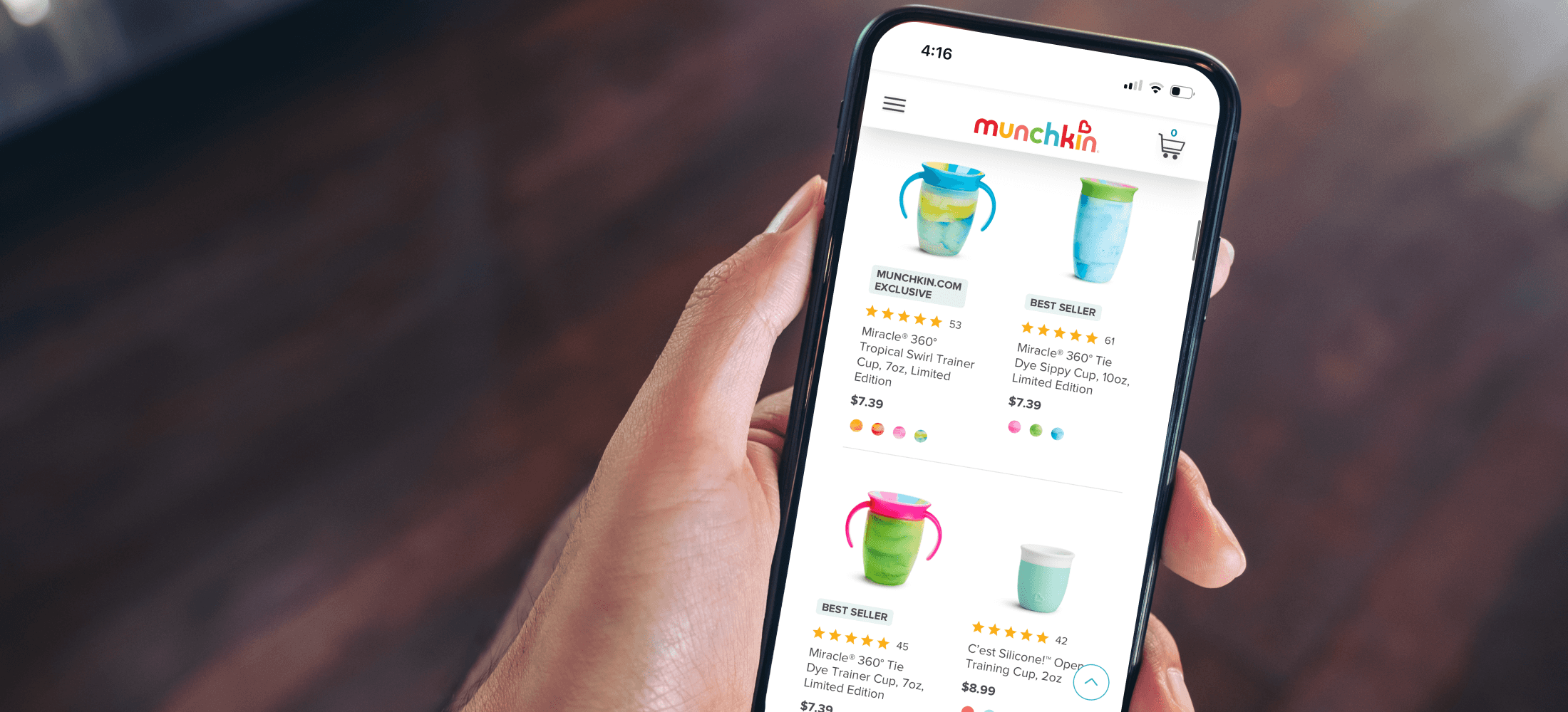
• Refined headlines to lead with the product's key innovation and unique value • Clarified free shipping eligibility to address a potential purchase hesitation • Added links for replacement parts and a "Find Your Size" guide to support post-purchase • Introduced size selectors and color swatches for intuitive, visually consistent navigation • Added safety assurance icons to reinforce trust at the point of decision


Redesigned the Benefits & Features section with stats, customer insights, and rich media, making product value easier to grasp at a glance. Built to scale responsively across all device sizes.

Added a 'How-to-Use' video section so caregivers could see products in action before buying, building confidence at a key decision point.
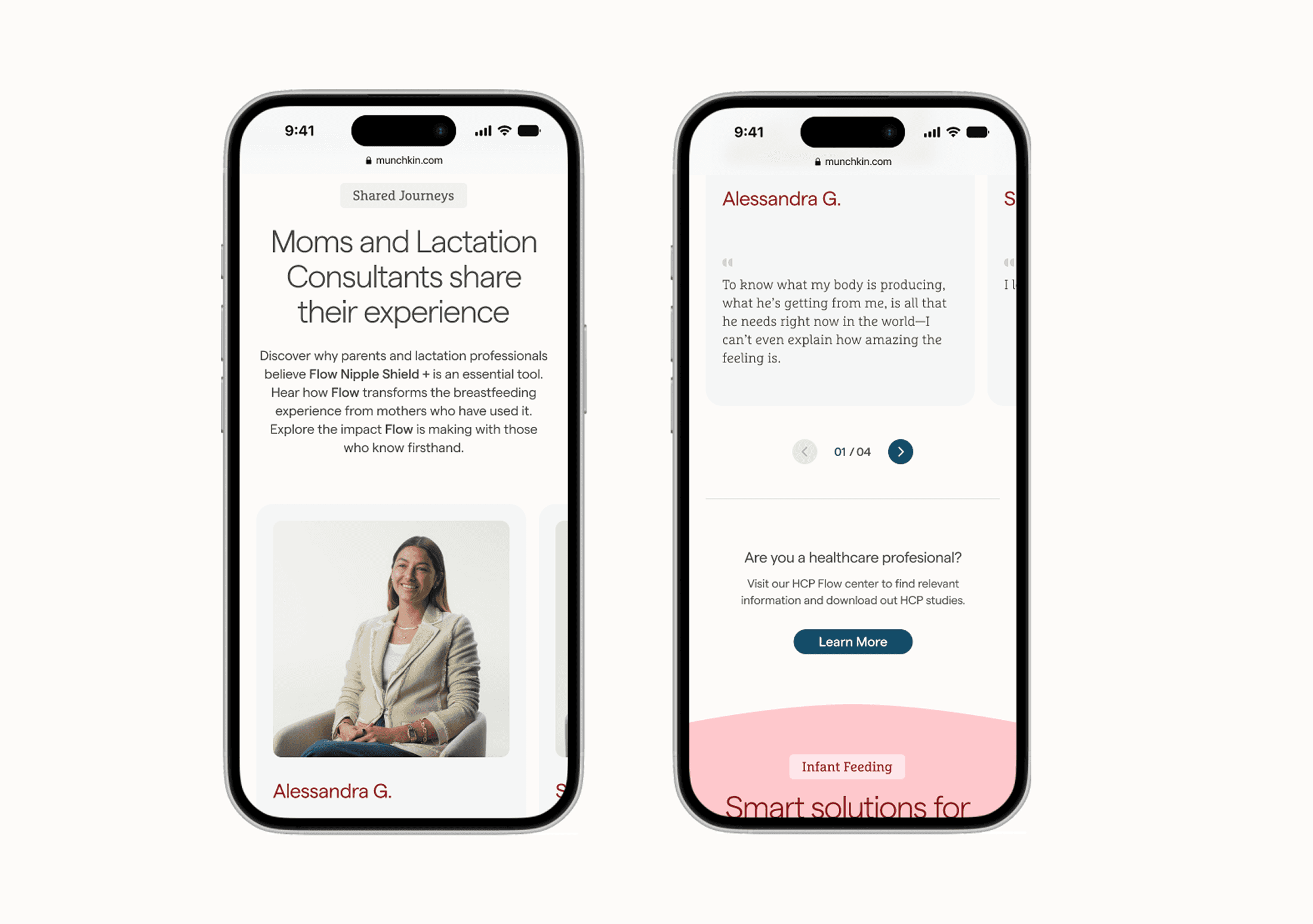
Surfaced testimonials from real moms and lactation consultants alongside a CTA linking to clinical studies and resources for healthcare professionals, building trust at both the emotional and clinical level.


Outcome
Increased user journey completion rate from product page to shopping bag by: +20%
Quick add-to-shopping bag, trust signals, reviews, etc.Achieved a sales increase in the Infant Nutrition category by: +10%
Clarified product value and simplified purchaseReduced bounce rate on the product pages by: -15%
Due to better content hierarchy, imagery, and clearer CTA/buttons
Other projects
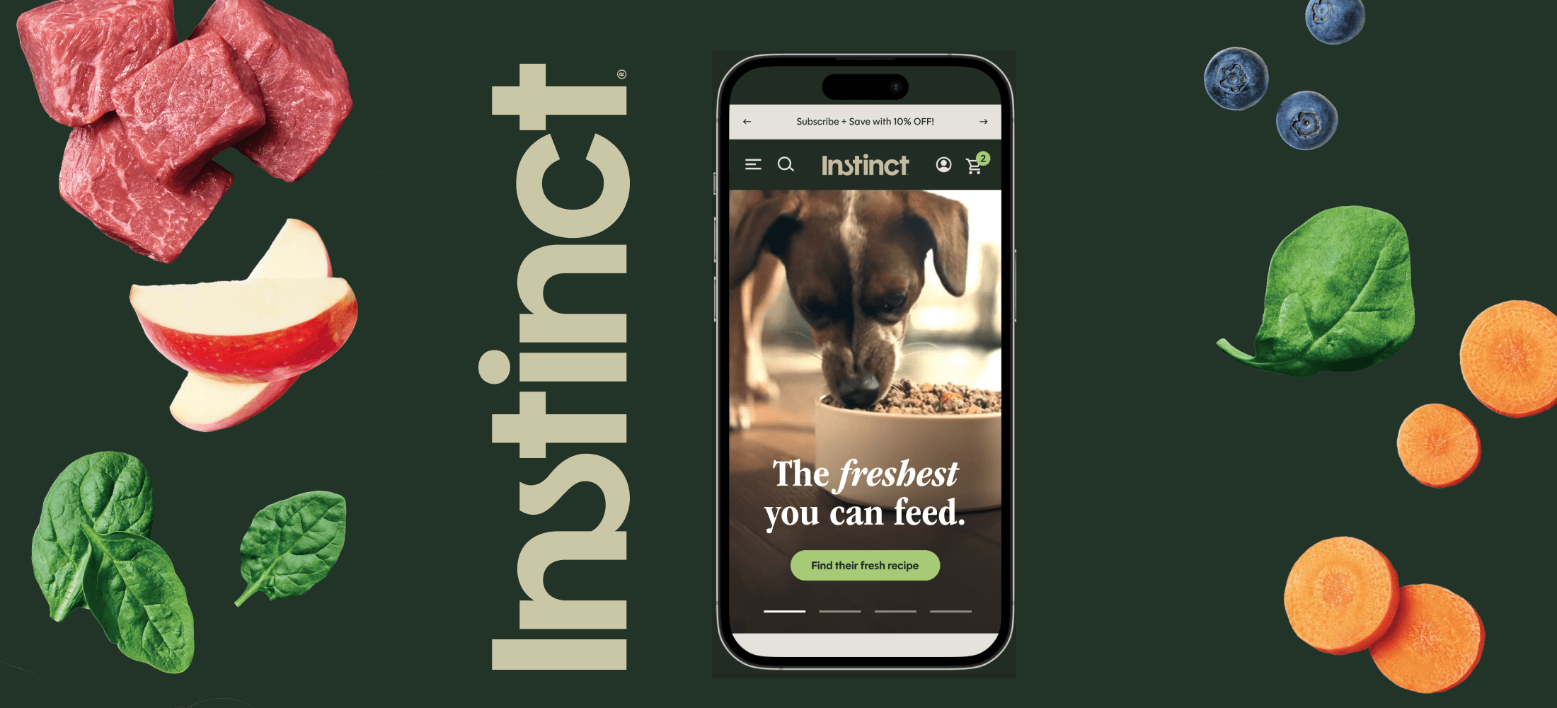
New: Instinct Pet Food Homepage
Nothing is fresher than raw

New: Instinct Product Details Page
Better product storytelling, smarter navigation, more confident buying decisions.
Redesign: Munchkin Homepage
A elevated shopping experience for one of the most trusted names in baby and family.
Munchkin Design System
An atomic Figma system built to scale with the brand.
Redesign: Munchkin Menu
Restructured to match how parents actually shop: by age, stage, and need.
Munchkin Product Listing Page
Smarter browsing, better discovery, fewer dead ends.

Build Your Own Cup
A proof of concept for personalized cup design and the research that shaped what came next.

Welcome Series Emails
A mobile-first welcome series that sets the tone for new Munchkin customers.
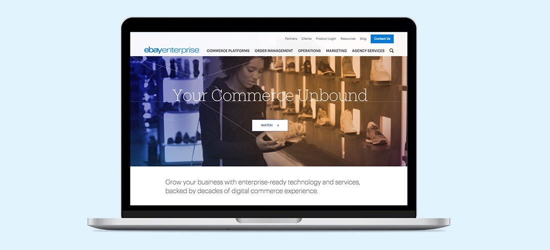
Redesign: eBay Enterpise Home
Rebuilding ebayenterprise.com from the ground up, starting with making it readable.
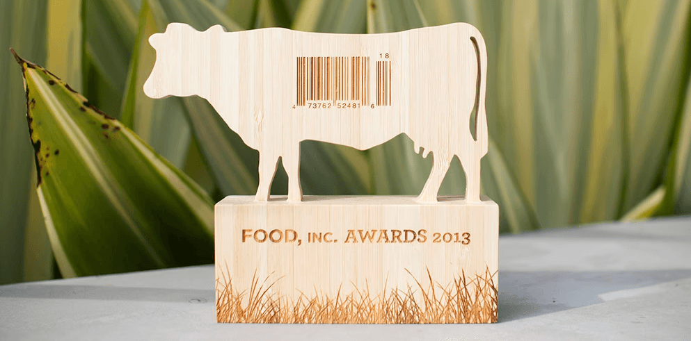
Food, Inc. Awards Trophy
Honoring individuals who embodied the documentary's message of promoting healthier food choices.
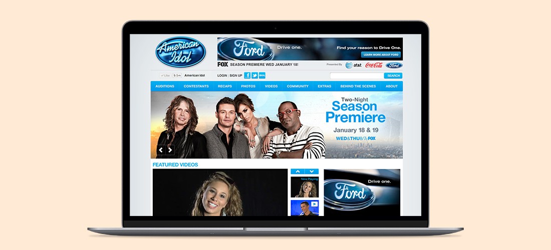
American Idol, Season 10: Homepage Redesign
Enhanced social features and live content throughout AmericanIdol.com
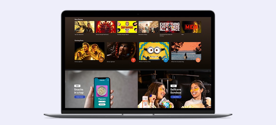
Cinépolis Movie Theater Snack Buying Feature
Snacks in a tap